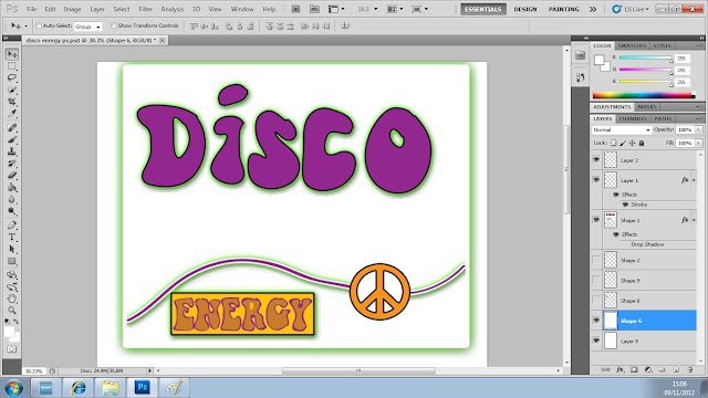
I started to develop the initial design from the hand drawn design. I transferred the image onto Adobe Ilustrator to begin tracing over the groovy 'Disco' and 'energy' lettering. The rest of the logo was not accurate and would be better being made directly on Adobe Photoshop.
Once I traced around the design I dragged it onto Photoshop where I cleared up a few bleeds and changed the colour to purple.
When I transferred the image onto Photoshop I wanted to get back the outline of my hand drawn grroovy 1970's disco design. I merged together two warning signs and deleted some of the lines to create a peace sign which I put in between the wavy line which goes across the logo. I then created a box around the energy which seemed to suit the logo better. I then added some drop shadow to all of these layers except the peace sign by clicking Blending options on the layer.

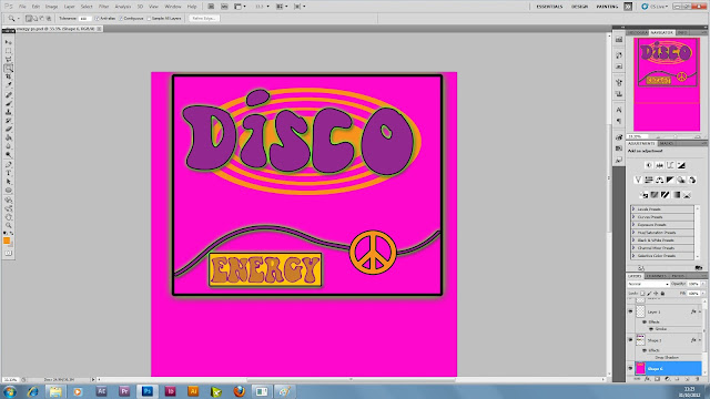
I added the orange rings which were in my original hand drawn design and changed the background to a cool pink colour. I also made the whole image stand out by adding a stroke on the box around the logo aswell as a slight stroke on the 'Disco', peace sign and 'Energy' box.

After I added more flowers and more rings the final design looked very groovy.


No comments:
Post a Comment