Friday, 18 January 2013

How I have produced my images

Before Production

Before I did my photoshoot I had to plan how it was going to be. My theme was fighting so I needed a muscular model who looked like a boxer. When I found my model I bought a plain white vest as what boxers wear training for a fight. I wanted the photoshoot to be somehwere lonely and eerie with a long corridor and run down walls. I gained permission for access to the changing rooms at Rylands Recreational Club. This was perfect as it had all of the characteristics what I needed.

During Production

I dressed my model in the white vest I had bought a grey hoodie and grey jogging pants. I wrapped bandages around his knuckeles and made them slightly dirty for attention to detail. The first part of the photoshoot I did where the sun was at it its highest in the sky. I took pictures of the model in different kinds of setting and lighting. I took pictures of the model: in the sun, in the shade, in front of a rusty grated window, on sandbags and in front of a skip. I then took pictures of my model inside the changing rooms in the corridor where the lighting is at the end of the corridor but not over the model. I then took pictures of my model sat down; punching a locker and in the shower under bright, dim and dark lighting.

After Post Production


Legal & ethical considerations


Equipment List
 Canon 1100D SLR camera
Hand bandages
Rugby ball
 
 
Advertising Standards Authority
My brochure has to abide by the rules of the of the Advertising Standards Authority Uk Non-Broadcast Advertising, Sales Promotion and Direct Marketing. (CAP Code) An example of this code which my Brochure must follow is the Exaggeration section 3.11 to 3.13. Rule 3.11 states that my Brochure "must not mislead consumers by exaggerating the capability or performance of a product." This means I cannot exaggerate how good my product is or tell lies to make it more superior than it is. If my brochure did this it would mislead consumers into believing my product was more superior than it actually is and be in breach of the Advertising Standards Authority rules.
 
Another rule my brochure needs to follow is in the Harm and Offence section rule 4.1. The rule states "Marketing communications must not contain anything that is likely to cause serious or widespread offence. Particular care must be taken to avoid causing offence on the grounds of race, religion, gender, sexual orientation, disability or age." This means my brochure cannot be offensive to anybody otherwise it is in breach of the Advertising Standards Authority Harm and Offence Section.

Raw Images


All other designs

When I developed my designs further their was 2 which I decided not to develop further. These were Robotic energy and Zaarb energy.
I drew up this robot trying to make the eye mask different from the Futurama character 'Bender' but I decided to not develop this idea further because it still looks a lot like bender and may be classed as copywright infringement.

I also drew up a cool looking electric zaarb font. Although this was a good design, it is hard to read the text and a similar font could easily be found on Dafont.

Monday, 12 November 2012

Developed Designs: Grip Tight Energy

I scanned my hand drawn design and traced around the fist on Adobe Ilustrator before transferring to Adobe Photoshop where I would start editing the fist.
I did not like the hand drawn font I had in my original sketch so I started to look on Dafont for different font designs which would suit my logo. I browsed various Font's on the different sub headings on Dafont trying to find the ideal one which I liked.

At first I was fond of this comic type font and though it would fit well with my project. At this time I did not know how I wanted the background but I assumed I would want a similar type of comic theme.


I put this with the fist on Photoshop and found a hand written font for 'Energy Drink'. This didn't look overly interesting and I re thought my Idea that grip tight is not very comical or 'Fun' and so I needed a change in font design to make it more fitting to the name.


 I found a distorted scratchy font on Dafont which matched the intention of my product immediately. I decided this would be the font I would use.


I added a background I found off Vector free, transferred my fist design from Illustrator and used the font I just found from Dafont. I placed the dist as it was punching from the lightning and found out it had a good effect.
  

I wanted to bring out the boldness of the grip tight and I did this by rasterizing the image, clicking blending options and adding a stroke.
This was my final logo design for my energy drink.

Tuesday, 6 November 2012

Developed Designs: Dentures Energy

The final logo of dentures energy was a groovy looking theme with a fiery gradient hair and an abstract title. This logo however looks to be targeted at a younger age range as I doubt older people would buy this brand.

Monday, 5 November 2012

Developed Designs: Disco Energy


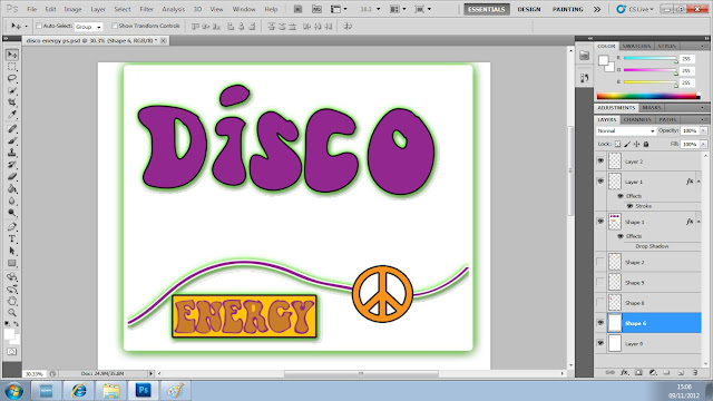
I started to develop the initial design from the hand drawn design. I transferred the image onto Adobe Ilustrator to begin tracing over the groovy 'Disco' and 'energy' lettering. The rest of the logo was not accurate and would be better being made directly on Adobe Photoshop.
Once I traced around the design I dragged it onto Photoshop where I cleared up a few bleeds and changed the colour to purple.


When I transferred the image onto Photoshop I wanted to get back the outline of my hand drawn grroovy 1970's disco design. I merged together two warning signs and deleted some of the lines to create a peace sign which I put in between the wavy line which goes across the logo. I then created a box around the energy which seemed to suit the logo better. I then added some drop shadow to all of these layers except the peace sign by clicking Blending options on the layer.


I added the orange rings which were in my original hand drawn design and changed the background to a cool pink colour. I also made the whole image stand out by adding a stroke on the box around the logo aswell as a slight stroke on the 'Disco', peace sign and 'Energy' box.


After I added more flowers and more rings the final design looked very groovy.