Monday, 12 November 2012

Developed Designs: Grip Tight Energy

I scanned my hand drawn design and traced around the fist on Adobe Ilustrator before transferring to Adobe Photoshop where I would start editing the fist.
I did not like the hand drawn font I had in my original sketch so I started to look on Dafont for different font designs which would suit my logo. I browsed various Font's on the different sub headings on Dafont trying to find the ideal one which I liked.

At first I was fond of this comic type font and though it would fit well with my project. At this time I did not know how I wanted the background but I assumed I would want a similar type of comic theme.


I put this with the fist on Photoshop and found a hand written font for 'Energy Drink'. This didn't look overly interesting and I re thought my Idea that grip tight is not very comical or 'Fun' and so I needed a change in font design to make it more fitting to the name.


 I found a distorted scratchy font on Dafont which matched the intention of my product immediately. I decided this would be the font I would use.


I added a background I found off Vector free, transferred my fist design from Illustrator and used the font I just found from Dafont. I placed the dist as it was punching from the lightning and found out it had a good effect.
  

I wanted to bring out the boldness of the grip tight and I did this by rasterizing the image, clicking blending options and adding a stroke.
This was my final logo design for my energy drink.

Tuesday, 6 November 2012

Developed Designs: Dentures Energy

The final logo of dentures energy was a groovy looking theme with a fiery gradient hair and an abstract title. This logo however looks to be targeted at a younger age range as I doubt older people would buy this brand.

Monday, 5 November 2012

Developed Designs: Disco Energy


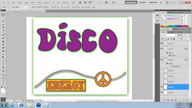
I started to develop the initial design from the hand drawn design. I transferred the image onto Adobe Ilustrator to begin tracing over the groovy 'Disco' and 'energy' lettering. The rest of the logo was not accurate and would be better being made directly on Adobe Photoshop.
Once I traced around the design I dragged it onto Photoshop where I cleared up a few bleeds and changed the colour to purple.


When I transferred the image onto Photoshop I wanted to get back the outline of my hand drawn grroovy 1970's disco design. I merged together two warning signs and deleted some of the lines to create a peace sign which I put in between the wavy line which goes across the logo. I then created a box around the energy which seemed to suit the logo better. I then added some drop shadow to all of these layers except the peace sign by clicking Blending options on the layer.


I added the orange rings which were in my original hand drawn design and changed the background to a cool pink colour. I also made the whole image stand out by adding a stroke on the box around the logo aswell as a slight stroke on the 'Disco', peace sign and 'Energy' box.


After I added more flowers and more rings the final design looked very groovy.

Wednesday, 31 October 2012

Traced Designs

I used Adobe Illustrator to trace over my sketches, using the Paintbrush tool, this made the tracings smooth and professional looking. It was a lot easier than doing it freehand. I used the colour black for most of my tracings but used purple on the 'Disco Energy' logo.

Sunday, 30 September 2012

Scans

This is my sketches scanned onto the computer. I am getting ready to trace the designs, save them separately ready to work on them individually in future on Photoshop.

Font and Brush Selection

To find my font's for my brand logo's I used a website called Dafont. Dafont allowed me to write my title in and get various different types of font. Their is different sub menu's on Dafont for the different types of font. For my 'Grip Tight' font, Iwanted a distorted font so I went on the distorted menu typed in 'GRIP TIGHT' and various options came up.

I scrolled through the pages but found none what I particularly liked for my brand, I then clicked on Eroded and found a text called plane crash which I liked and fit the theme of my product.

Sketches

I brainstormed five brand ideas for our energy drink. All of which have not been done before and would be regarded as USP's. I came up with the Ideas:
  1. Zaarb Energy
  2. Dentures Energy
  3. Grip-Tight Energy
  4. Robot Charged
  5. Disco Energy
I had to market these products different from existing products to create a USP, I created Dentures Energy to target a more older mature generation from the ages of 55-70. Energy drinks have never been targeted at this age group before creating a USP for my energy drink. Below are my finished initial hand sketches of my brand ideas.